
A playful brand built for movement, creativity + connection.
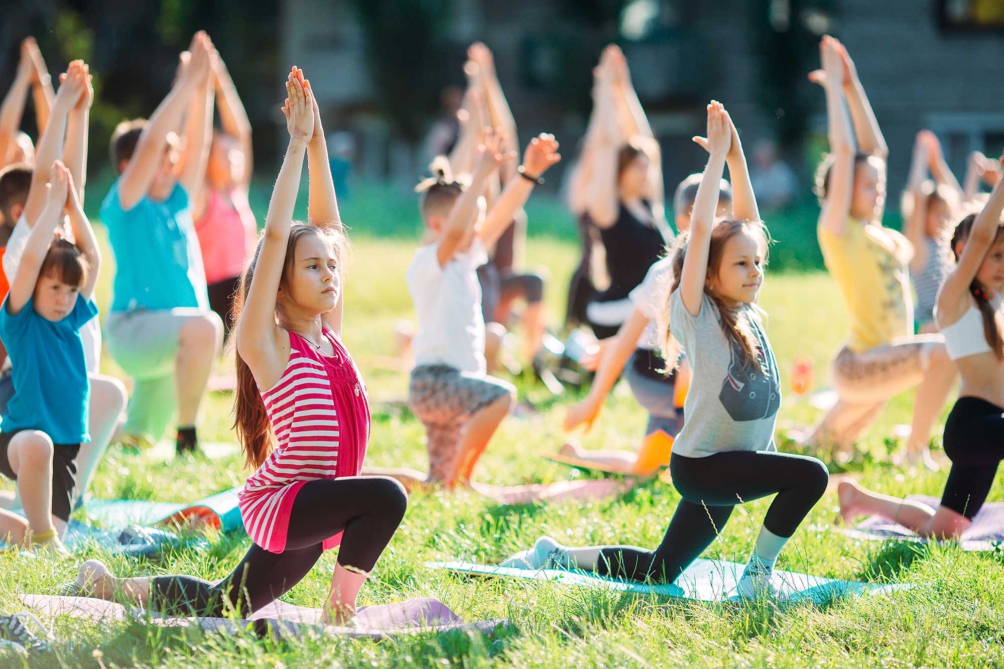
Yogi Adventures brings together kids yoga, mindfulness, team-building games and creative fun. The goal was to create a visual identity that felt every bit as joyful and energetic as the experience itself—while still giving the program a strong, recognizable brand that could grow across events, partnerships, print and digital marketing.
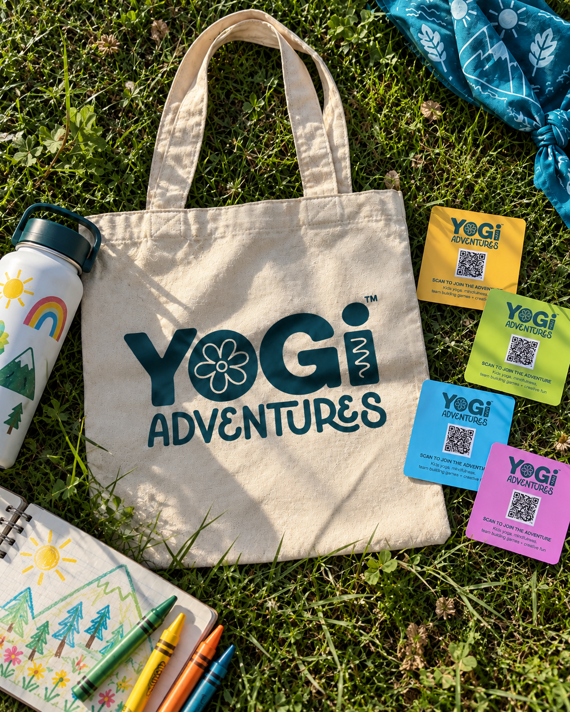
BRANDED MERCH + TAKEAWAYS Custom tote bag and colorful QR cards designed to extend the Yogi Adventures brand beyond the event.
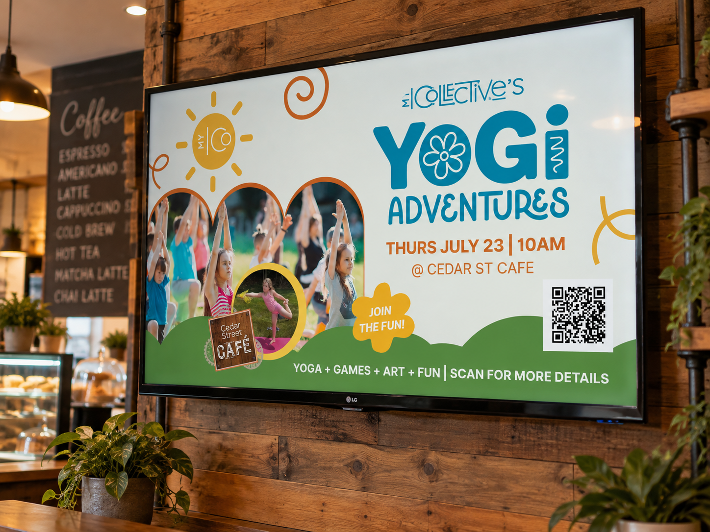
PARTNER + EVENT MARKETING Branded digital event graphics created for partner locations and community promotions.
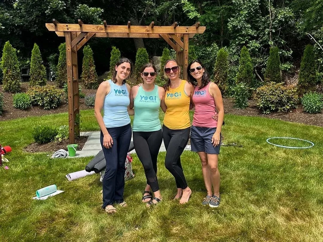
BRAND IN ACTION Branded apparel and event imagery showing the Yogi Adventures identity brought into the real-world experience.
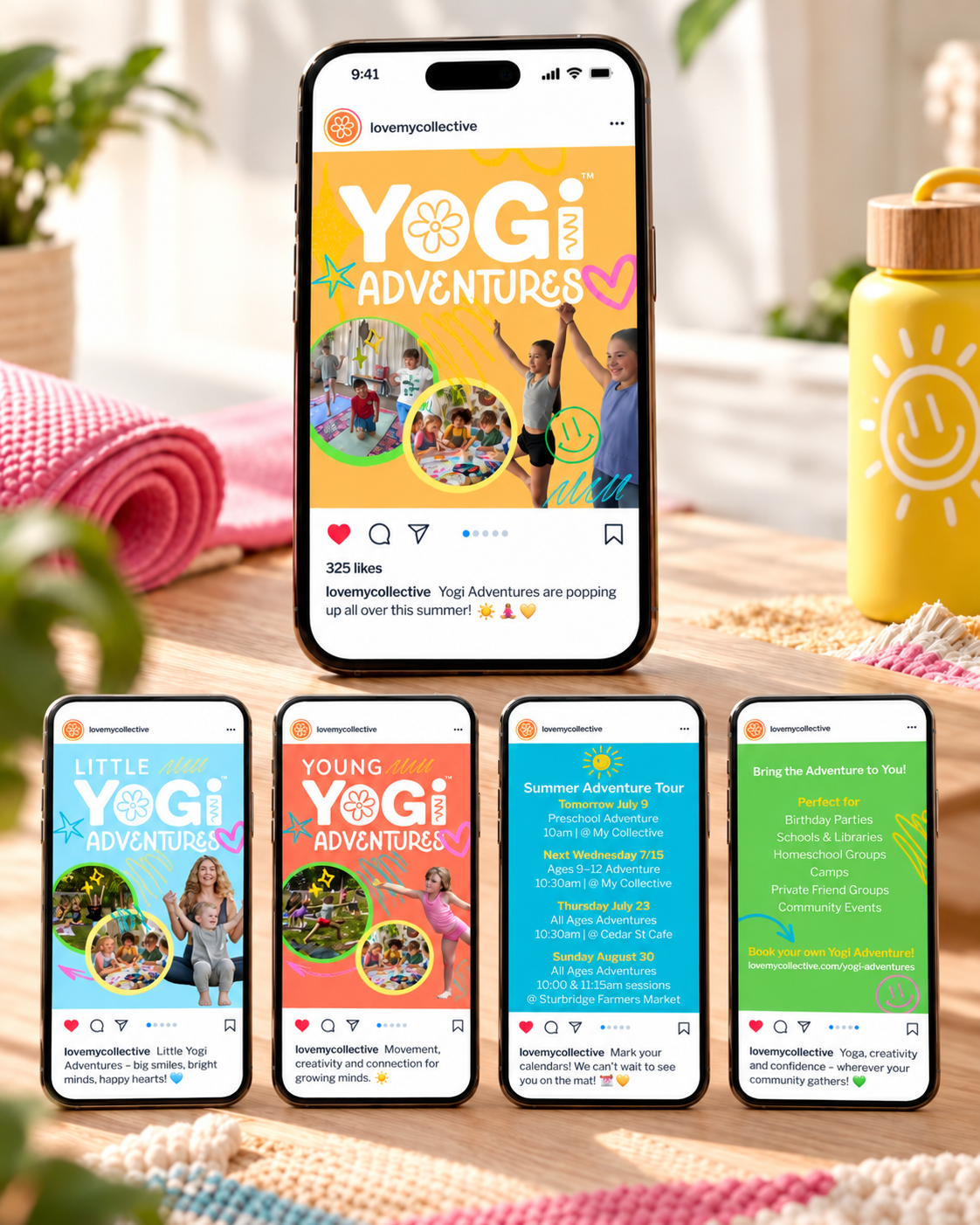
SOCIAL MEDIA CAMPAIGN A coordinated series of social graphics created to promote programs, events and private bookings.
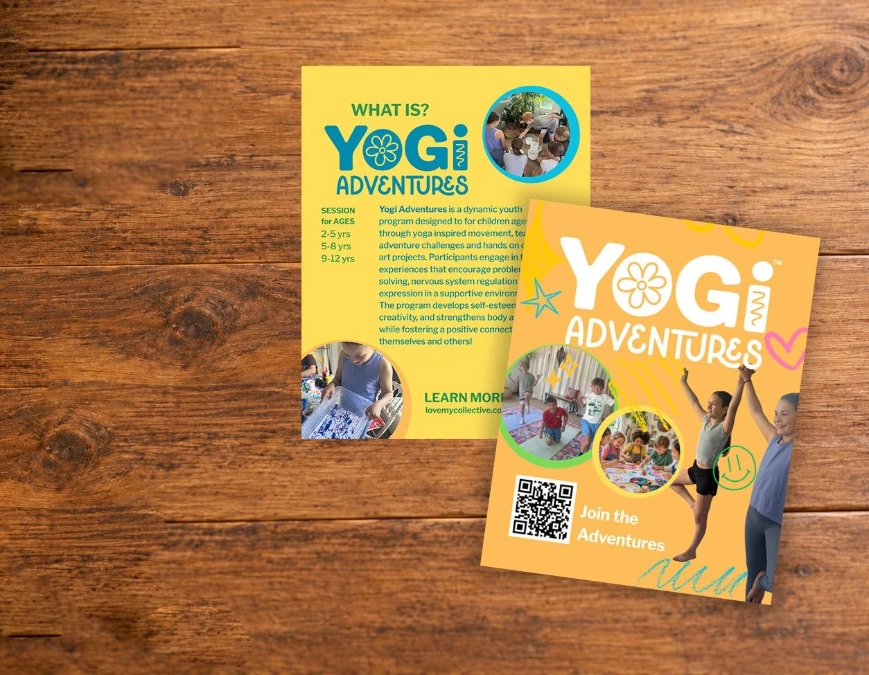
PRINT COLLATERAL Informational cards and promotional materials designed to introduce the program and encourage sign-ups.
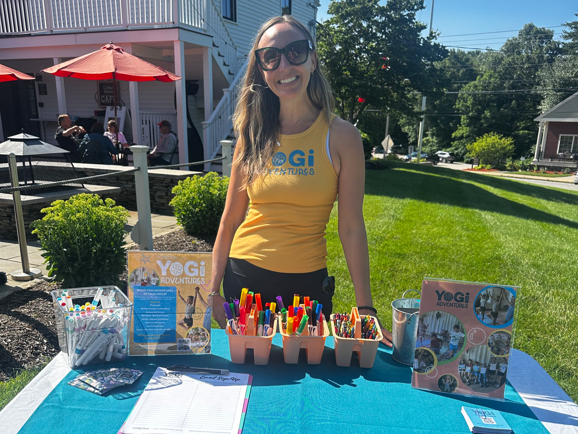
EVENT EXPERIENCE A cohesive mix of signage, printed materials and branded elements created for in-person community events.
Project Overview
Turning a program into a brand.
Yogi Adventures needed more than a logo. It needed a personality.
I developed a bright, flexible visual system designed to instantly communicate fun, movement, creativity and adventure. The identity combines bold typography, playful hand-drawn elements, energetic color and real photography to create something kids are excited by—but that still feels polished and trustworthy to parents, schools, community partners and event venues.
From tote bags and QR cards to event signage, social campaigns and on-location marketing, every piece was designed to feel connected to the same world.
The Concept
Playful, not childish.
The Yogi Adventures identity was built around the idea that wellness for kids doesn’t have to feel quiet, serious or overly polished.
It can be colorful.
It can move.
It can get messy.
It can feel like an adventure.
The oversized YOGI lettering creates an instantly recognizable anchor, while the flower, hand-drawn marks, bright color palette and candid imagery add warmth and personality. The supporting system can shift between age groups, locations and events without losing the core identity.
Services
Brand Identity · Art Direction · Graphic Design · Social Media Design · Print Collateral · Event Marketing · Environmental Graphics